Interactive Parking Meter
Improved and more accessible interactive parking meter
Design Challenge | Shopify Design Challenge
Position | UI Designer
Duration | 3 days
Tools | Figma, Illustrator
Background
When applying to be a product designer for Shopify’s Spring 2020 internship, Shopify put together a design challenge to understand applyers’ design thinking, process and overall showcase their skills.
Problem
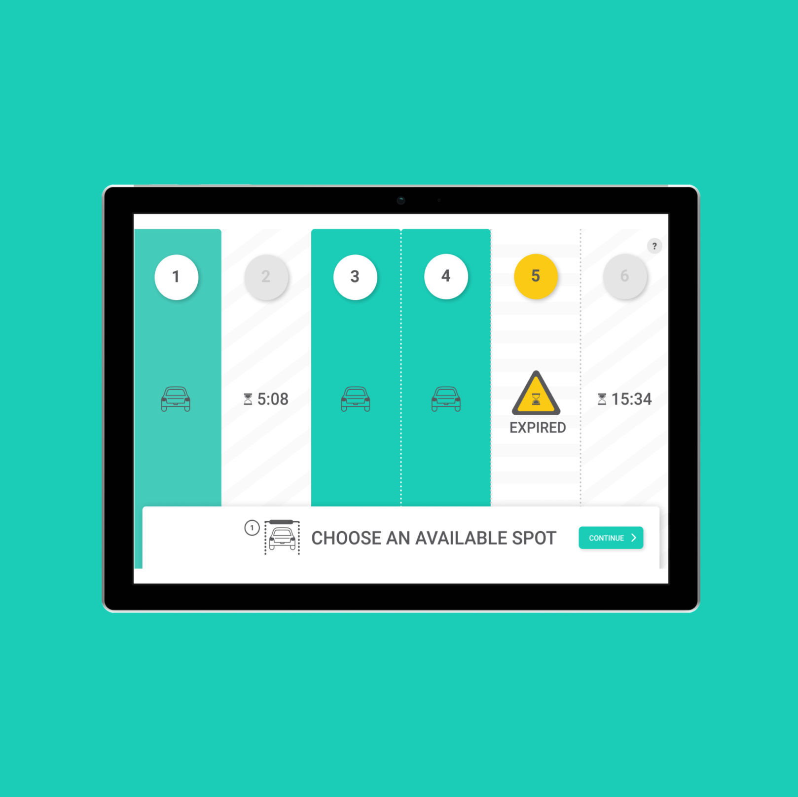
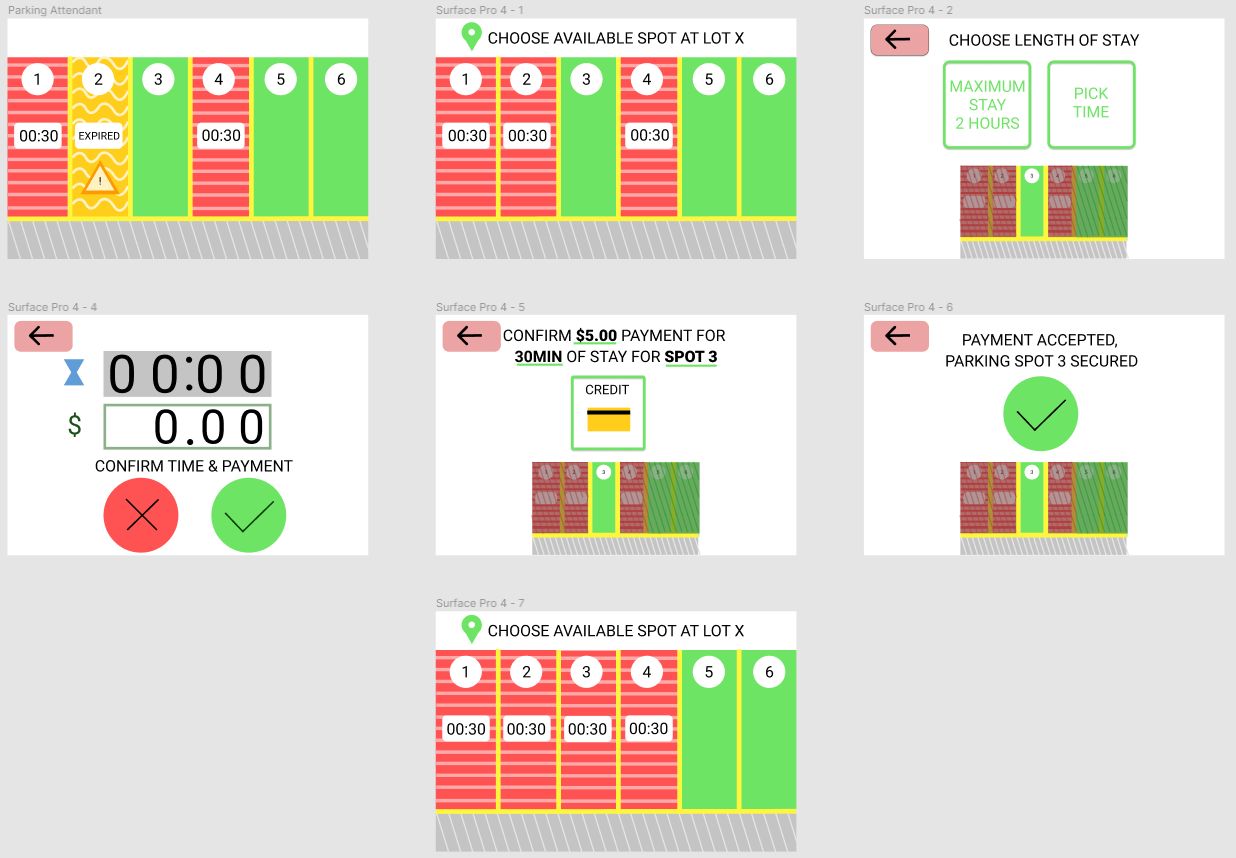
Design the touchscreen interface so that drivers can pay for their parking spot for a certain duration, and parking attendants can give tickets to cars who do not pay or whose parking has expired.
Outcome
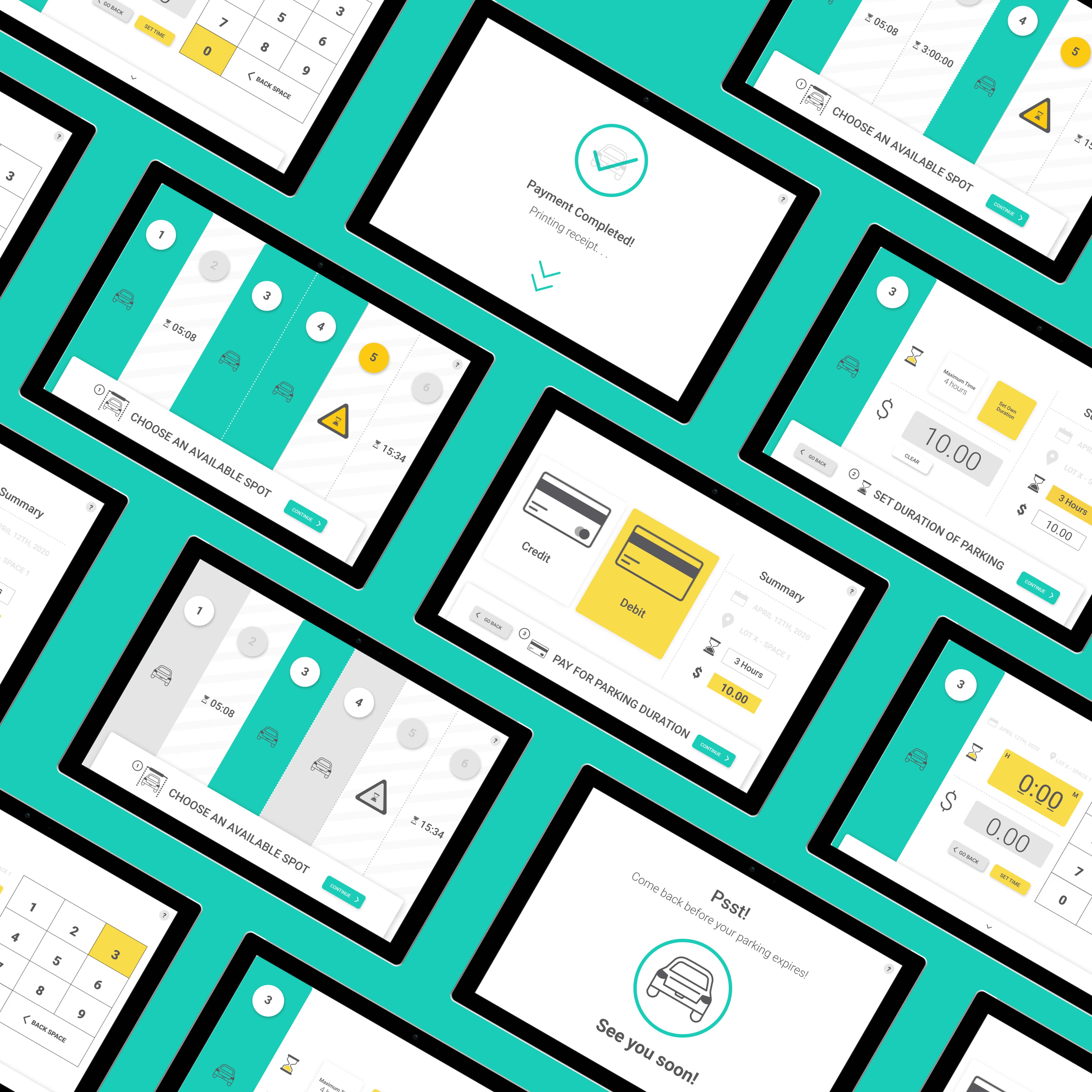
Improved and more accessible touchscreen parking meter with a redesigned interface.
Constraints
Shopify established constraints that limits designing a parking meter that incorporates various advanced technology. The parking meter does not have a pinch or zoom ability, it can accept credit card payments but is not otherwise connected to the internet and is not bluetooth enabled.
User Interviews
To begin the process in creating the solution, I determined key aspects to implement within the parking meter as guided by the problem brief.
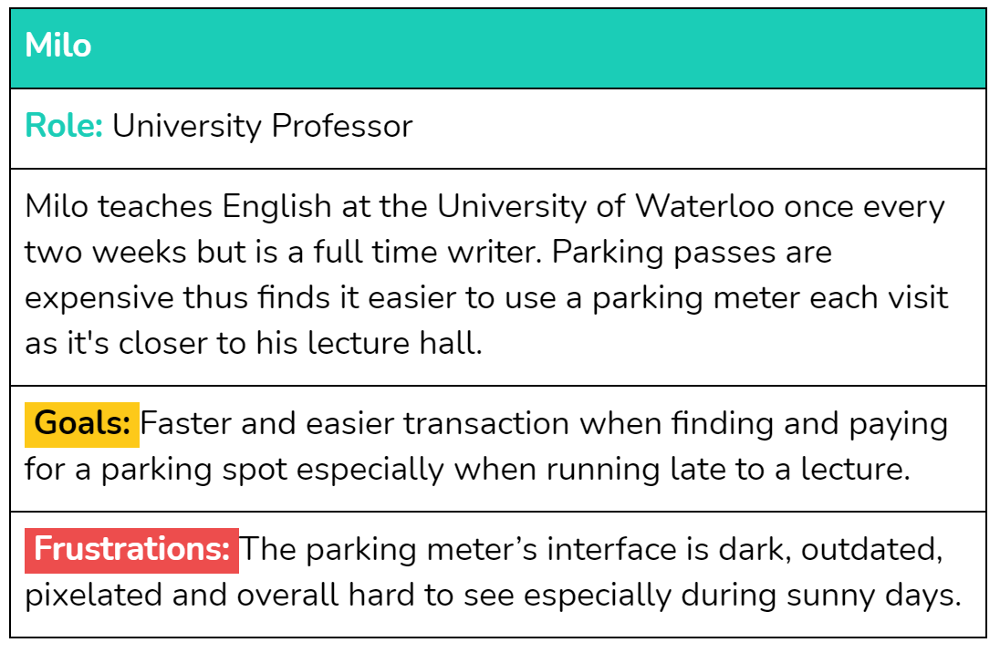
Personas
Meet Milo, our main persona for the context of this design challenge.

Problem Analysis
To begin the process in creating the solution, I ensured that I was able to map out the interaction and navigation process of individuals finding and paying for a parking spot, while considering inaccessible aspects of a general parking meter that I can alleviate for this redesign.
Design Process
Visual Identity
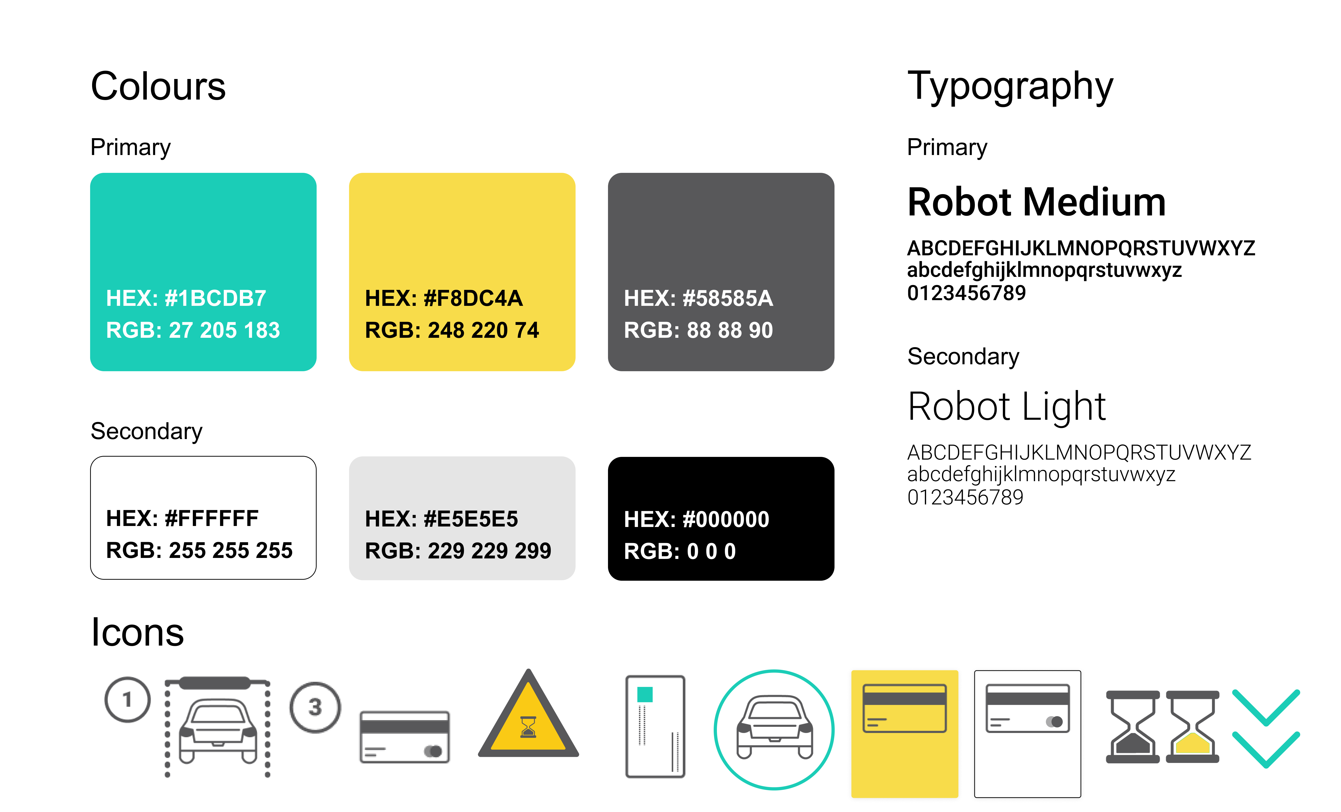
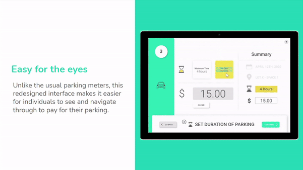
Visual Identity: In order to create an accessible parking meter, the interface must have accessibility friendly colours, it has to include large and simple icons to easily decipher, and the payment process should be straightforward.
Wireframes
As the UX/UI designer I first began designing low-fidelity wireframes prior to finalizing the high-fidelity prototypes.

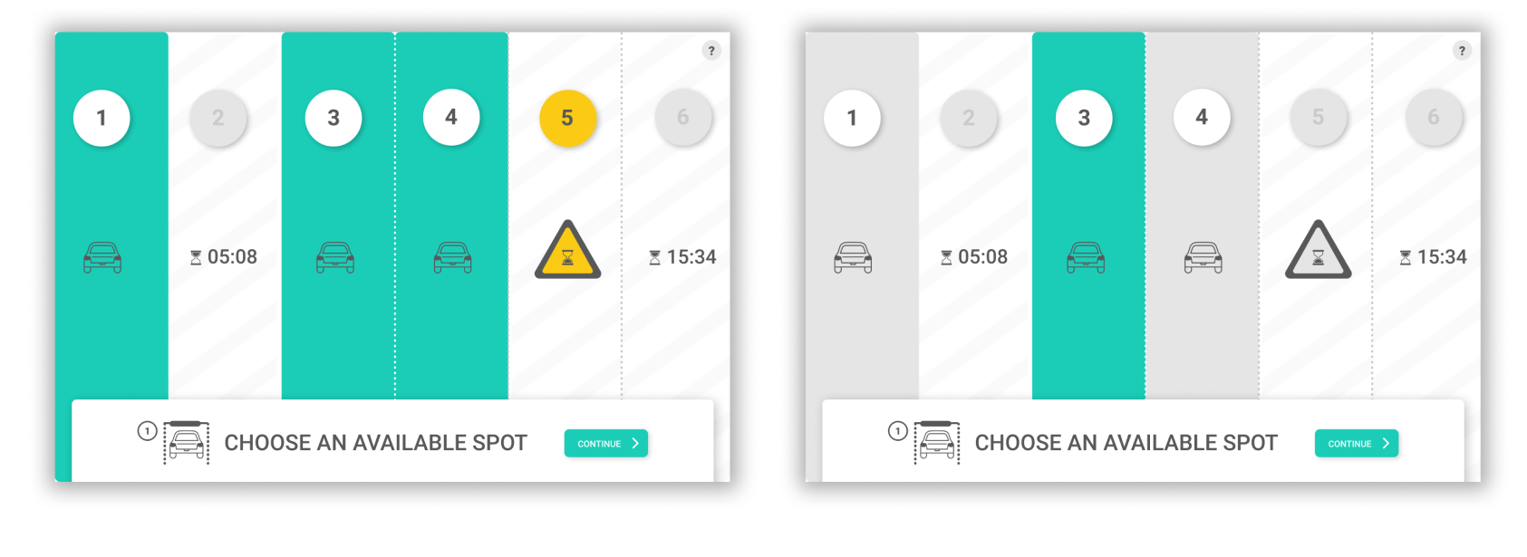
Feedback + Iterations + Testing
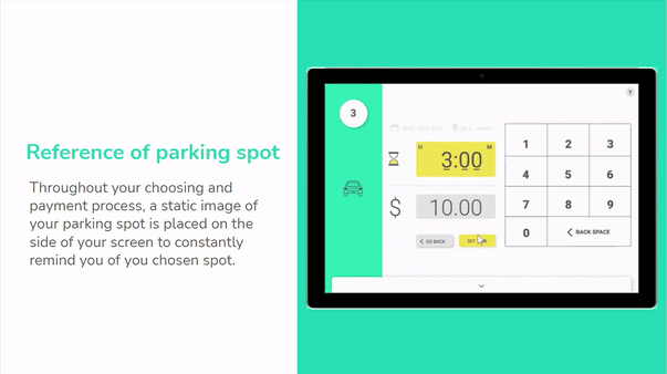
Using the feedback received from my user testing with fellow classmates and professors I thought about how else I can make this parking meter as visually accessible as possible without incorporating advanced technology. I re-designed the the payment and setting duration of parking screens to compare which design is more accessible and easy to navigate through.

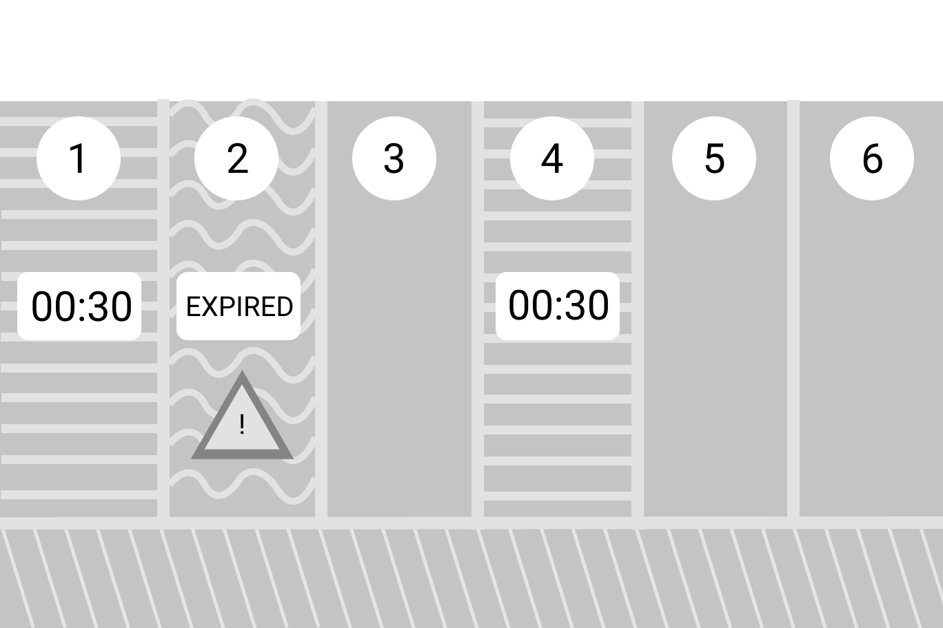
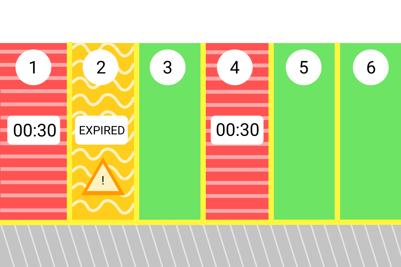
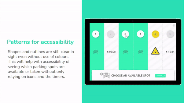
Use of patterns in accessible design
Patterns create an additional way to help understand which parking spots are available vs taken when looking at the parking meter. Even if the UIs are in monochromatic grey (rough representation of how a screen may look like for a peron who is colour blind) the patterns are still noticeable.
The Solution
After receiving feedback and iterating my wireframes, I moved on to creating the high fidelity designs and revisited my problem statements and guiding questions.
Interact with It!
Play around with the prototype however you want. Experience the redesigned interactive parking meter.
Reflection
Parking meters have inaccessible features too! Although we don’t think about it as much, there are challenges individuals experience when using a parking meter. Their screens can be hard to read and see, you may not know where to pay and which spot you’re actually paying for. Sometimes the weather can hinder your process of interacting with a parking meter too (i.e. lack of sun can make the UI of the meter too hard to see).
It’s challenging to design a solution that limits existing advanced technologies. We live in an ever-changing world with various advanced technologies being developed, however, not all products need disruptive technologies and features incorporated in them to ensure its usability!